
Cross-Cultural UX: The Differences in Eastern and Western Design Perspectives
Von Sophia Gruber am 14.01.2024
Introduction
Rolling out a mobile application on the international market will inevitably bring up the question of localization. At first, the solution may seem simple, maybe even obvious. Offering local language translations must be enough, right? It may even seem tempting (not to mention cost-efficient) to use machine translation—AI is getting so reliable these days, after all.
However, this approach is likely to fail, especially in global markets that do not subscribe to Western cultures and philosophies. These values are ingrained into user experience design more deeply than it may seem at first glance. Something as seemingly universal as a burger menu icon may be misunderstood in markets that follow different UX conventions; white space, which is an essential staple of good design in the West, may be seen as a waste of space in the East. This divergence between Eastern and Western UX design offers valuable insights to be explored. Large companies such as Amazon, Mozilla, and Airbnb have all realized the divide in UI/UX design practices and employ specialized localization teams all over the world. Their job is not simply to translate language but the user experience as a whole.
Western UX
Western UX design is ruled by principles of simplicity and minimalism. The emphasis lies on including only the most essential elements and information to provide a sleek and seamless user experience. Cognitive overload is to be avoided at all costs. Search functionalities and recommendation systems cater to the user with tailored precision. The white space that makes this reduction to the cognitive load possible not only serves an aesthetic, but also a practical function—and it does not exist in the interface alone. Western UX designers also practice a sort of functional white space: applications are typically designed for singular purposes. They do one thing really well. This allows users to mix and match the applications on their devices according to the functionalities they would like to use on a highly individual basis.
Eastern UX
With the key features of Western UX in mind, the world of Eastern UX seems like a complete contradiction. Design patterns that are shunned in the West are considered best practice instead. In order to dive deeper into these differences, I will focus on UX Design that is common in China. However, it is important to note that for the sake of comparison, some generalization may occur. There are as many design trends in China as there are in Europe, for instance, and designs that are tailored to the preferences of Chinese users may have significant differences to those aimed at Japanese, Korean, or Vietnamese users.
Use of Space
One of the most striking differences in Chinese UX is the use of white space—or rather, the lack of it. Instead of perceiving information overload as a drawback, Chinese users view a crowded interface as an efficient use of space. This is in part due to the difference in cultural philosophy. To Chinese users, it is important to get high amounts of contextual information before they make decisions, while ambiguity and potential risk are factors that can decrease the user experience.
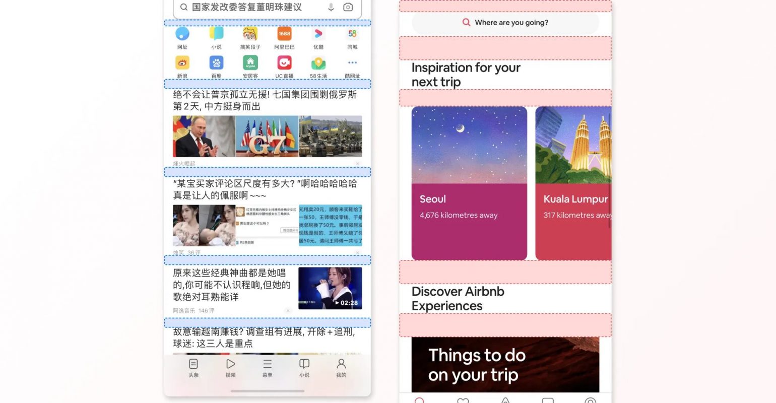
Image source: https://uxdesign.cc/a-few-ui-differences-between-chinese-and-english-apps-e72400bb08da
Differences in Language
Why such a high concentration of information is possible is because of the way the written language works. Chinese characters convey a lot of information while using very limited space in comparison to Western scripts such as the Latin alphabet, which chains representations of phonetic sounds to form words, which then form sentences. Chinese script, in contrast, makes it possible to express entire concepts in a single character. In addition, there are no spaces between words, not to mention the fact that Chinese script can be written both left to right as well as top to bottom. All these characteristics make Chinese an incredibly flexible language, and it makes reading much more efficient as well. Chinese speakers are able to parse heaps of information at just a glance.
Chinese script has even more differences to most Western scripts. For one, Chinese fonts do not have bold or italic variations, which is why Chinese UX designers instead resort to using color, saturation, and contrast to emphasize text. This leads to interfaces that can quickly seem colorful and loud to eyes that are used to Western UI. This colorful UI landscape is not a negative thing by any means—bright, contrasting colors such as red, yellow, and blue have positive connotations in Chinese culture and can be found in Chinese design everywhere. Furthermore, digital fonts are more limited for Chinese than they are for Latin scripts, as each font needs to encompass thousands of characters. Designing a new font can easily take many years and many designers. Therefore, many Chinese UIs may seem quite similar, as they tend to use the same few font faces that are available to a wide range of devices.
Navigation Patterns
Another significant difference lies in navigation patterns. While Western navigation is based on search, recommendation, and limited CTAs per page, Chinese UX leans towards a much heavier use of links. This is, again, because of the Chinese writing system. Although the nature of Chinese characters makes reading them easy and efficient, it makes writing them less so. This is especially true on digital devices, where keyboards only have a limited number of keys. The focus of user behavior when navigating an application or website therefore lies on browsing rather than searching to find the desired content. Pages often have extensive menus and multiple CTAs to help users find what they are looking for without the need for textual input.
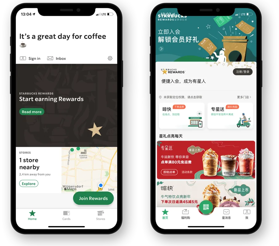
Image source: https://uxdesign.cc/key-differences-between-designing-for-china-and-the-west-dad2c5132521
Super Apps
This wealth of information and content also comes in at the functional level of application design. Most Chinese internet users access the internet on their mobile phones, which makes QR codes extremely popular and a daily occurrence for users. And while Western users were primarily introduced to the internet via the desktop computer, the Chinese market has a strong mobile-first approach. Western applications tend to focus on singular key features; the Eastern app market has seen the emergence of so-called super apps. Apps such as WeChat, developed by Tencent, combine a multitude of services and platforms through a web of integrated partnerships, making it possible to do all online activities in one place. Super apps can cover everything from social media, e-commerce, and entertainment to banking and transportation. To illustrate how prevalent these apps are: in 2016, Chinese mobile users already spent over a third of their phone time on WeChat alone. Super apps also allow developers to create extension apps: these are apps that are specifically built for and then integrated and used within the super app. In WeChat, these are called mini programs. They do not need to be installed, as they already come with the whole package.
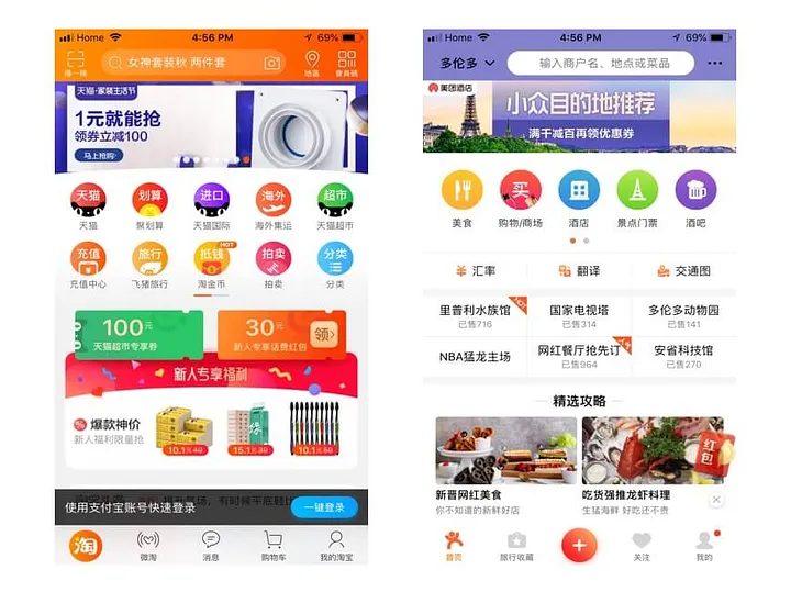
Image source: https://uxdesign.cc/content-or-white-space-chinese-vs-western-design-aesthetics-2eef79e12844
Recognizing the Importance of Cross-Cultural UX
Beyond recognizing the differences in design practices, we can look at Chinese UX design as an opportunity to learn and enrich our own work. With the continual advance of globalization, it seems prudent to take a look at how other cultures approach the design of mobile applications. In addition, the global market power of countries such as China, Japan, and India continues to grow. This makes having an understanding of how cultural perspectives influence UX imperative for successful localization. It is, in some way, a matter of cultural accessibility to ensure that applications are localized properly and thoroughly. They should provide a seamless and positive experience that is tailored to the user’s culture, language, and the philosophies they bring with them. All these aspects affect the way design is understood on a profound level that should not be underestimated. Misunderstandings, misinterpretations, and overall negative user experiences can all be avoided if localization is done right.
Conclusion
In summary, the divergence in UX philosophies between the East and the West transcends cultural mannerisms and differences in language. Taking a deeper look presents opportunities for cross-cultural learning, market expansion, and enhanced accessibility. By acknowledging and incorporating these differences, designers and developers can create applications that resonate with users regardless of cultural background. Bridging the UX divide involves more than linguistic considerations; it demands an understanding of the many factors that shape user interactions worldwide.
References
Cheng, Y., & Nielsen, J. (2016, August 21). Nielsen Norman Group: UX Research, Training, and Consulting. Nielsen Norman Group. https://www.nngroup.com/articles/wechat-integrated-ux/
Lau, Z. (2023, July 17). Bridging the Cultural UX Divide: Why China’s Approach Matters. Digital Creative Asia. https://digitalcreative.cn/blog/how-china-ux-is-different
Liu, F. (2018, September 9). Apps Within Apps: UX Lessons from WeChat Mini Programs. Nielsen Norman Group. https://www.nngroup.com/articles/wechat-mini-programs/
Ng, M. (2022, March 5). A few UI differences between Chinese and English apps. Medium. https://uxdesign.cc/a-few-ui-differences-between-chinese-and-english-apps-e72400bb08da
Persson, I. (2024, January 4). Less is not more: Designing for people and for the planet. Medium. https://uxdesign.cc/less-is-not-more-designing-for-people-and-for-the-planet-998f0fbc9ff0
Shen, J. (n.d.). Cross-cultural Design and the Role of UX | Toptal®. Toptal Design Blog. Retrieved January 13, 2024, from https://www.toptal.com/designers/web/cross-cultural-design
Wallet, B. (2023, December 21). The deeper meaning behind Japan’s unique UX design culture. https://newsletter.uxdesign.cc/p/the-deeper-meaning-behind-japans?publication_id=240203&utm_medium=email&utm_campaign=email-share&triggerShare=true&r=1pbvyn
Zhong, Y. (2021, October 7). Key differences between designing for China and the West. Medium. https://uxdesign.cc/key-differences-between-designing-for-china-and-the-west-dad2c5132521
Zhong, Y. (2018, September 18). Content or white space? Chinese vs. Western design aesthetics. Medium. https://uxdesign.cc/content-or-white-space-chinese-vs-western-design-aesthetics-2eef79e12844
Cover Image by starline on Freepik.

The comments are closed.