This was push.conference 2016
Von Matthias Lick am 25.10.2016
The push.conference is an annually held UX conference in the heart of Munich.
push.conference unites creative coding and user experience design, by offering a platform for designers, developers and UX professionals.
That’s the official statement on the website (http://push-conference.com/2016/) of the conference.
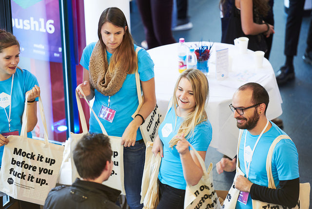
Everything starts with the registration on Thursday: all visitors get their badge and their goodie bag in a stylish jute bag. Coffee and snacks are prepared and for a successful conference nothing is left in the way.
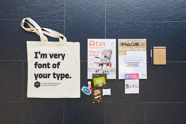
The awesome goodie bag at push conference
To generate a short review of the talks, I will pick my favourites of the conference.
Scott Savarie | Product Manager @ InVision on Truth is contextual Or: The holy grail of process and collaboration
Scott Savarie talks about that design has gotten insane and there are no defined roles anymore. Where do designers fit in this new world? A world, where the term designer, doesn’t really mean to design for one thing in times of VR and wearables.
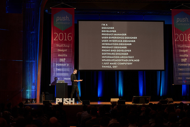
Scott Savarie about what designers are these days, or what you telling your mum if she asks about your job.
He defines 3 steps how designers can fit in this world:
- Stop reinventing things and start standardizing –> create guidelines
- Ask more questions before you start –> who would even use it?
- Use data and be reflective
and his main advice is
Include designers in bigger questions and do not let them only push pixels around!!!
Nathalie Nahai | Web Psychologist @ The Web Psychologist Ltd. on The psychology behind successful products
Nathalie Nahai makes it possible that psychology ist the most interesting thing in the world.
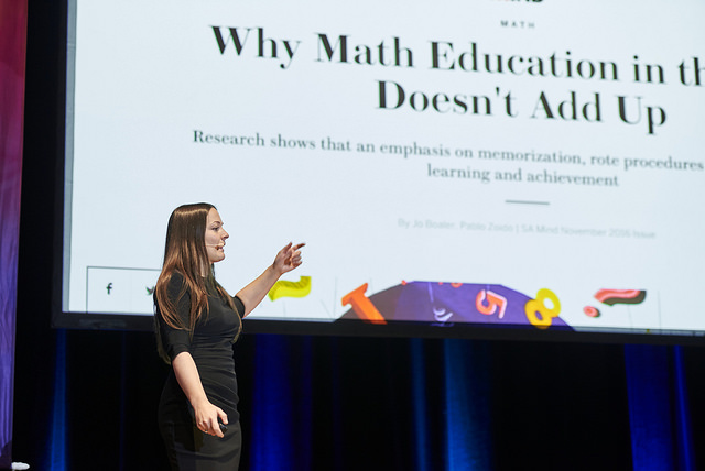
Nathalie Nahai with probably the best psychology talk ever.
With her 7 points to make a product successful she really stuns me. The seven points are:
- Endowed Progress
- Sunk-cost fallacy
- Appointment dynamic
- Cognitive load
- Processing fluency
- Hedonic adaptation
- Dopamine loops
For more information look at her awesome slides.
Nick Babich | Sofware Devoloper and UX Enthusiast @ RingCentral on How to be a good guide: Crafting Navigation Experiences
Nick Babich brings the different navigation types to the test. For mobile he reflects three types:
- Hamburger menus are hiding all information and decreases engagement time.
- Gestures are always hidden, a tutorial for the user is needed and there are no standards.
- Tabs are always visible and increases engagement by 70%, the downtime of tabs is that there are only 5 options available.
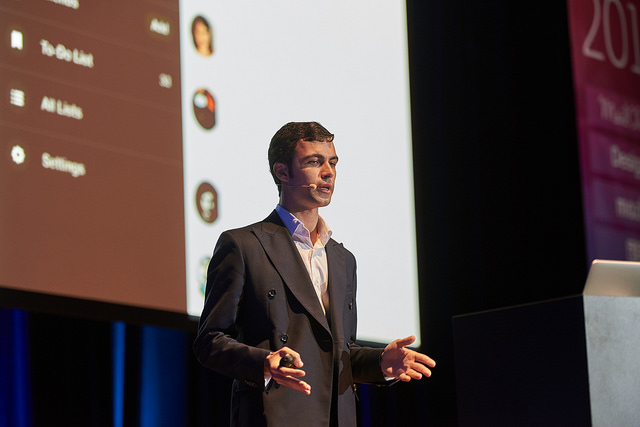
Nick Babich on different navigation types
Here you can find the whole presentation on slideshare.
Adrian Zumbrunnen | UX Designer @ Freelance at Google on Smart Transitions in UI Design
Adrian Zumbrunnen declares that people are engaged to transitions, because we all react to movement. He says that we should make an interface that is familiar to the real world.
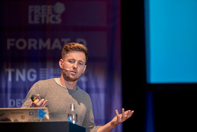
“Distraction comes from movement.” – Adrian Zumbrunnen
He also got 5 things how we can make better transitions in the web and mobile world:
- Orientation –> Show the user where he goes.
- Responsiveness –> Good animation is responsive and tells a story.
- Time –> 100-300ms ought to be enough for everything and duration adds signification.
- Easing –> Follow the nature and physics and be responsive to motion curves.
- Personality –> Try to get a connection between transitions and the product.
Beside the talks the other highlights were:
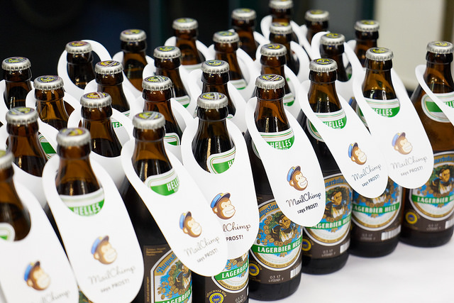
the free drinks by Mailchimp on Thursday,
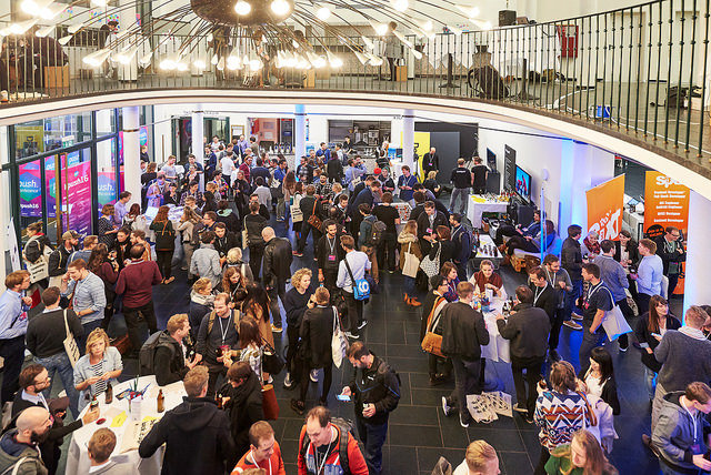
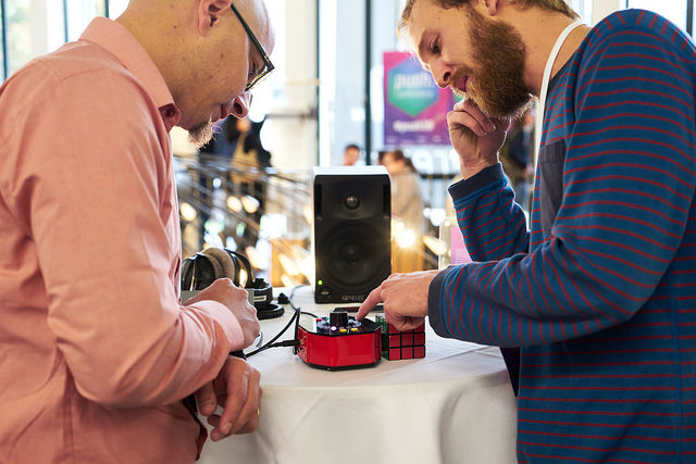
the interactive installations
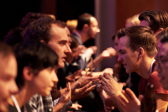
and the speed networking on Thursday evening.
For further information go to http://push-conference.com/ and here you can find more fotos (all fotos in this post are from there and © push.conference).
Thanks #push16 for an awesome conference, see you at #push17.

The comments are closed.