The Impact of Dark Mode on Mobile Usability and User Experience
Von Laura Kainzbauer am 10.06.2024
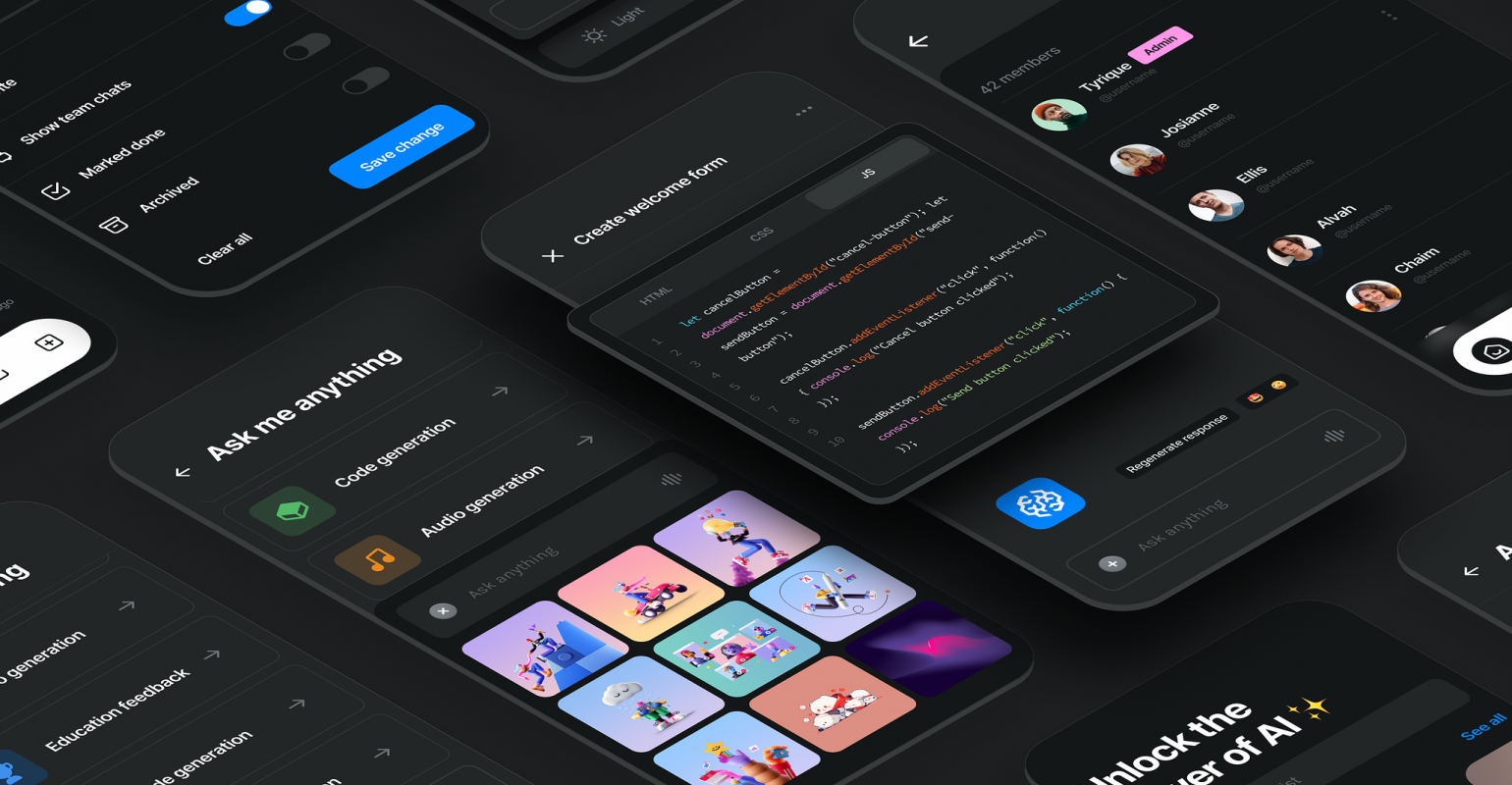
Dark mode has evolved from a barely used feature to a widespread standard in mobile app design. It offers a sleek, modern aesthetic and provides several potential benefits for usability and user experience. This post explores the impact of dark mode, using insights from various sources to present a well-rounded understanding of its advantages, challenges, and best practices for implementation.
The Rise of Dark Mode
Dark mode’s rise in popularity can be attributed to its aesthetic appeal and functional benefits. It provides a visually striking alternative to traditional light modes, often perceived as more elegant and modern. Users increasingly seek customizable experiences, and dark mode offers a personalized touch, allowing for a more tailored user experience. This customization aligns with broader trends in user interface design, where personalization is key to enhancing user engagement and satisfaction. The ability to switch between light and dark themes allows users to adapt the interface to their preferences and environmental lighting conditions, further enhancing the user experience.
Benefits for Usability
Reduced Eye Strain
One of the most significant advantages of dark mode is its potential to reduce eye strain, especially in low-light conditions. According to research from the Nielsen Norman Group (NNG), darker interfaces can decrease the overall brightness and glare from screens, making it easier on the eyes during prolonged use. This is particularly beneficial for users who spend long hours on their devices, as it can reduce discomfort and eye fatigue. By reducing the amount of blue light emitted from screens, dark mode can help mitigate some of the adverse effects associated with longer screen time, such as digital eye strain and disrupted sleep patterns. This makes dark mode an attractive feature for users seeking a more comfortable and health-conscious digital experience.
Battery Efficiency
Another key benefit is improved battery life for devices with OLED or AMOLED screens. These screens can turn off individual pixels to display black, thereby consuming less power compared to light pixels. This results in significant energy savings when using dark mode, which is a considerable advantage for mobile users looking to extend their device’s battery life. By conserving battery life, dark mode not only enhances the user experience by reducing the frequency of charging but also supports the growing emphasis on energy efficiency and sustainability in technology design. This aspect of dark mode appeals to environmentally conscious users and those who prioritize long-lasting device performance.
Design Considerations
Contrast and Readability
Implementing dark mode effectively requires careful attention to contrast and readability. Poorly executed dark mode designs can lead to insufficient contrast between text and background, making it difficult for users to read content comfortably. The Nielsen Norman Group points out that suitable contrast ratios are crucial for readability and accessibility. Ensuring that text remains legible in dark mode involves selecting appropriate colors that provide enough contrast without causing eye strain. This often means using off-white or light grey text instead of pure white to reduce glare. Properly addressing these contrast issues is vital to maintain accessibility standards and ensure that all users, including those with visual impairments, can comfortably use the application.
Visual Hierarchy
Maintaining a clear visual hierarchy is essential in dark mode design. Designers must select color palettes that not only provide adequate contrast but also enhance the overall user interface. This involves careful use of color to differentiate between various UI elements and ensure that important information stands out. For example, lighter shades can be used for primary actions and highlights, while darker tones can serve as backgrounds to support visual separation. This thoughtful use of color can help guide the user’s attention to critical elements and actions, improving overall usability. A well-defined visual hierarchy also aids in creating an intuitive and efficient user experience, which is particularly important in complex applications where users need to navigate through multiple layers of information.
Implementation Challenges
Implementing dark mode is not without its challenges. Designers must ensure that all elements of the user interface, including icons, images, and interactive components, are optimized for dark backgrounds. This often involves creating alternative assets and conducting thorough testing across different devices and lighting conditions to ensure consistency. For instance, images with transparent backgrounds or drop shadows may need adjustments to look right in dark mode. Additionally, developers must address potential issues with text readability and contrast, ensuring that interactive elements remain visually distinct and accessible. Overcoming these challenges requires a comprehensive approach to design and development, incorporating feedback from user testing to refine the dark mode experience continually.
User Preferences and Adaptation
Despite its benefits, dark mode is not universally preferred. Some users find dark backgrounds less readable, particularly for text-heavy tasks. Therefore, it’s essential to provide options for users to switch between dark and light modes. Persistence of user preferences is also crucial; settings should be saved across sessions to ensure a seamless experience. Providing users with control over their visual environment is key to accommodating different needs and preferences. For instance, offering a scheduled dark mode that automatically activates based on the time of day can enhance usability and satisfaction. By allowing users to tailor their experience, applications can better meet individual preferences and situational requirements.
Context-Specific Usage
Dark mode may be particularly beneficial in specific contexts, such as during nighttime use or in dark environments where a bright screen can be disruptive. Users can appreciate the flexibility to adapt the interface to their current context, which can enhance their overall experience. For instance, using dark mode in a low-light environment can reduce screen glare and prevent eye strain, making it easier to focus on content. Additionally, dark mode can be advantageous for users who are sensitive to light or suffer from migraines, as it provides a more comfortable viewing experience. By understanding the various contexts in which dark mode can be beneficial, designers can create more user-centric and adaptable interfaces.
Conclusion
Dark mode offers numerous benefits, including reduced eye strain and improved battery efficiency, making it a valuable feature for enhancing mobile app usability and user experience. However, its successful implementation requires careful consideration of contrast, readability, and visual hierarchy to avoid potential errors. By addressing these challenges and incorporating user-centric design principles, designers can create inclusive and effective dark mode experiences that cater to a diverse range of user preferences.
Ultimately, the success of dark mode in enhancing usability and user experience relies on thoughtful design and a deep understanding of user needs. As mobile applications continue to evolve, dark mode stands out as a feature that, when implemented correctly, can significantly enhance the user experience in various contexts. By prioritizing user comfort, readability, and energy efficiency, designers can ensure that dark mode remains a valuable and well-loved feature in the ever-changing landscape of mobile app design.
References
Budiu, R. (2020, February 2). Dark Mode vs. Light Mode: Which Is Better? Nielsen Norman Group. https://www.nngroup.com/articles/dark-mode/
Kohler, T., & Zhang, A. (2023, August 27). Dark Mode: How Users Think about It and Issues to Avoid. Nielsen Norman Group. https://www.nngroup.com/articles/dark-mode-users-issues/
Dark Mode. (n.d.). Apple Developer Documentation. https://developer.apple.com/design/human-interface-guidelines/dark-mode
Material Design. (n.d.). Material Design. https://m2.material.io/design/color/dark-theme.html
Dark Mode: All the Pros and Cons to Consider. (2021, August 3). Linearity Blog. https://www.linearity.io/blog/dark-mode/
Trawiński, W. (2024, May 24). Dark mode — beyond basics. JavaScript Everyday. https://medium.com/javascript-everyday/dark-mode-beyond-basics-2651bfc6c1a7
Setting And Persisting Color Scheme Preferences With CSS And A “Touch” Of JavaScript. (2024, March 25). Smashing Magazine. https://www.smashingmagazine.com/2024/03/setting-persisting-color-scheme-preferences-css-javascript/
Implementing Dark Mode in Web Applications. (2024, January 28). DEV Community. https://dev.to/bartzalewski/implementing-dark-mode-in-web-applications-4h31

The comments are closed.